光影是是构图和传递调性的关键,也是视觉表现重要的组成部分。在设计作品时,一个好的设计师都需要巧妙地运用到各种光影效果。今天就和大家介绍光影效果的各种知识。

1、聚光
聚光是最常见光,是设计中用的最多的光。

上面图片使用了聚光,使得图片中的场景更像一个舞台,而中间的物体就是“主角”。具体可以看下图:

2、自然光
自然光很好理解,也就是阳光。在产品设计中经常可以看到很多设计师都是用自然光进行创作。

因为在设计过程中不需要考虑氛围,所以更需要使用到自然光来控制产品的光影效果。
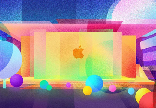
3、逆光
逆光是聚光的一种,但因为角度有些特殊,所以呈现的视觉效果与其它的聚光不太一样。当画面需要逆光时,只需要在固有色上添加黑色蒙板和边缘高光,就能够塑造出一个处于逆光的物体。

在各种小米的海报中,我们可以看出小米经常使用逆光营造氛围的方法设计作品。

在现实中,光影的层次通常不是那么理想,光的复杂性超出了肉眼所能看到的。因此,我们需要注意在绘画的过程中,它抽象使用光影。例如,自然光是普遍存在的,所以我们把它抽象成四个均匀分布的小光源,依次照射到物体上:

在它们的叠加部分,可以清楚地看到从1到4的重要程度依次递减。根据这种方法,可以得到光影的层次关系,在绘制光模拟图标或操作活动时可以更加精细。


所有光和影都有助于主体创造体积感。一个合格的三维图形必须具有四个基本属性:高光/过多颜色/明暗边界和反射。

需要使用超现实主义的方法来过滤阳光,从各种色调中提取出互补色,在现实与幻想之间创造出奇妙的效果。

在投影上添加颜色倾向,就可以让作品中的光影效果更佳。


图标好坏除了造型,质感也很重要,通常图标设计主要是下面4种形式。

大家可以看下面的示例:该图主体是POI的图标加上微信的对话框,再加上一些星星。

主要由三个发光体和底下的投影制作而成,这个可以在PS中制作,比较简单。

然后点击滤镜-模糊画廊-场景模糊,设置key-point,调试模糊值和透明度/亮度,塑造出光影效果。

光影效果在图标、数据可视化、插图等产品设计中都可以使用到。大家可以尝试运用光影效果来制作作品。
更多推荐: